The Brief
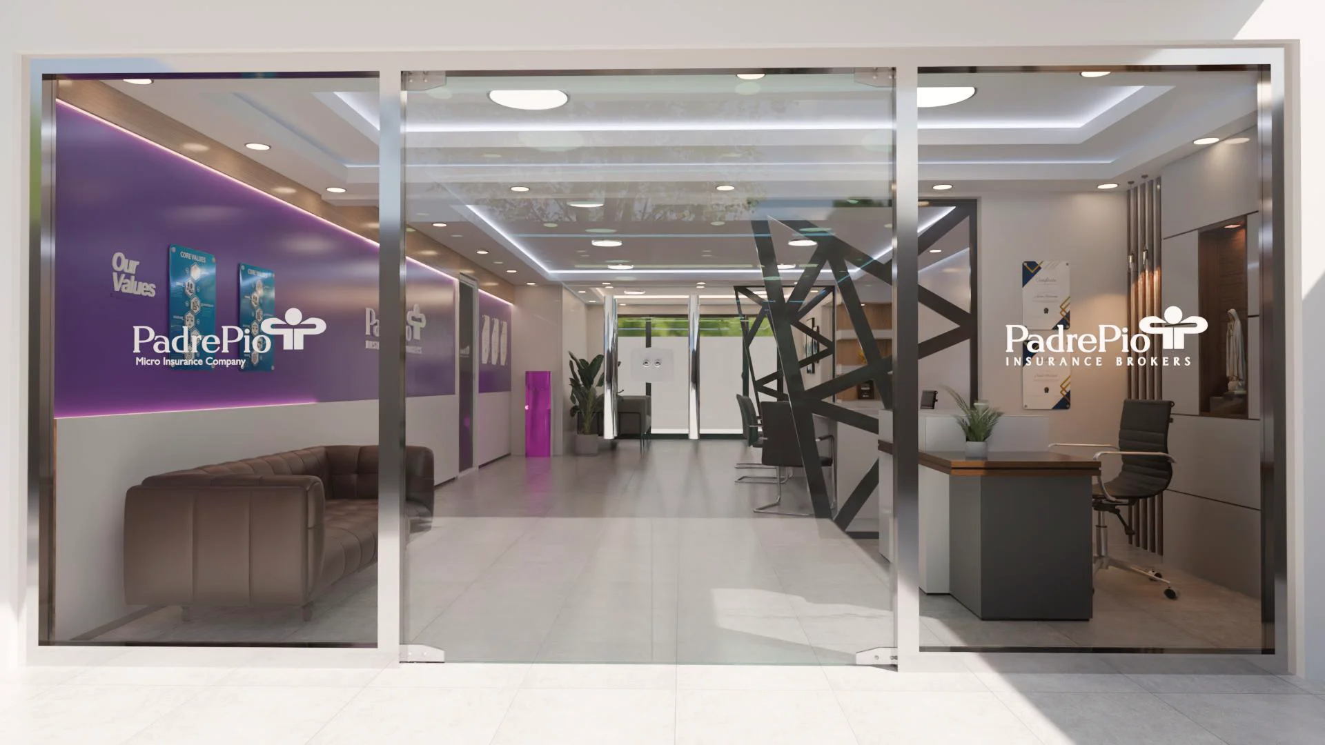
Padre Pio required a complete interior fit-out for two adjacent commercial units, one for their Micro Insurance Company and one for their Insurance Brokers division. Both spaces were delivered from empty shell, with the client's goal being a professional, brand-consistent environment that would build confidence with walk-in customers and visiting partners alike.
Approach
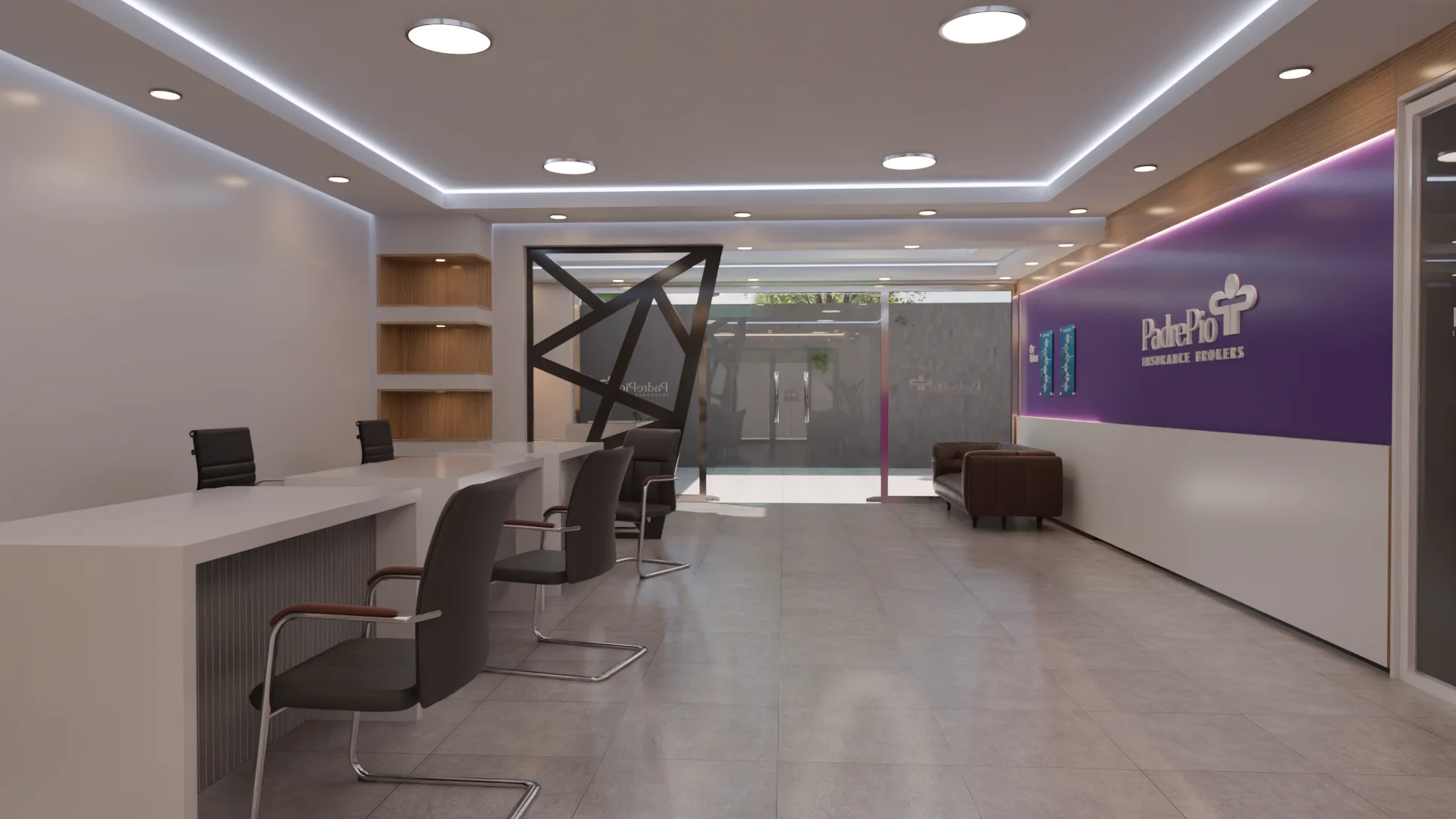
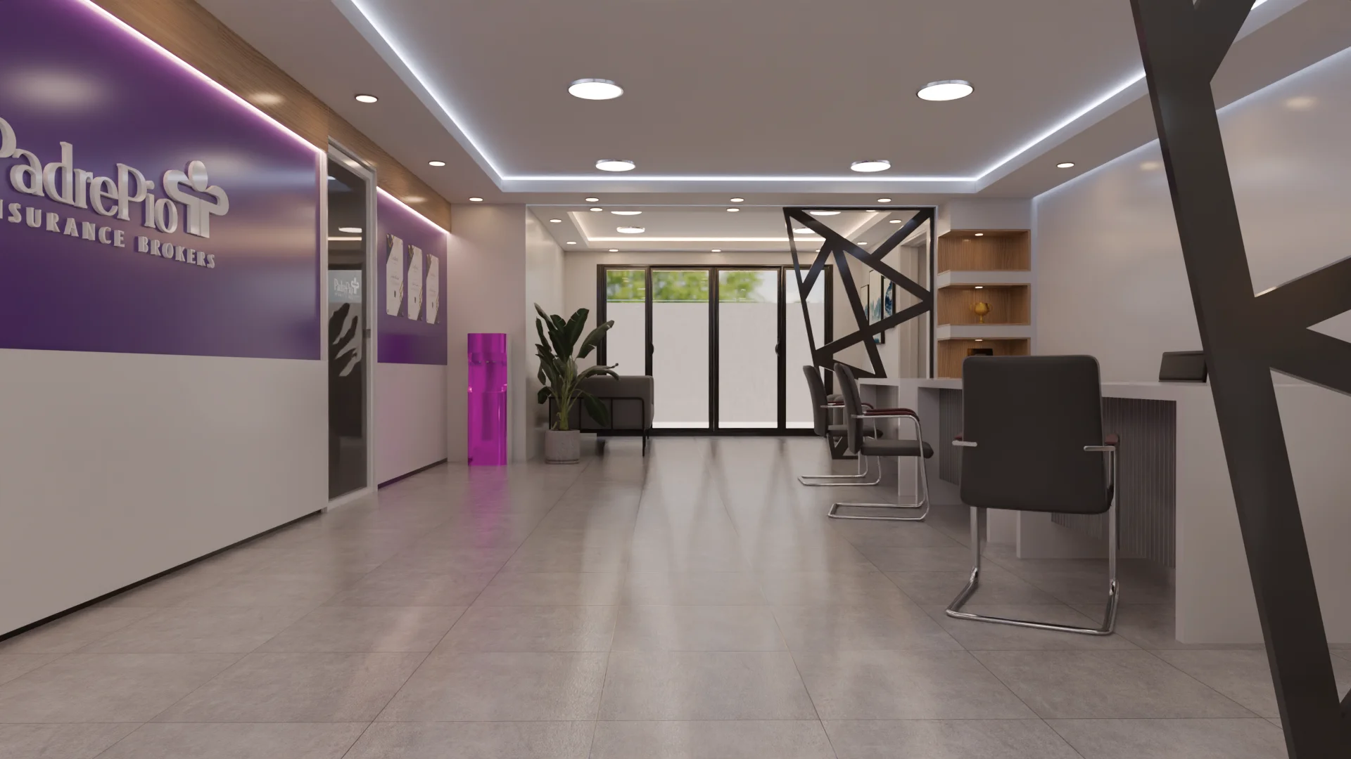
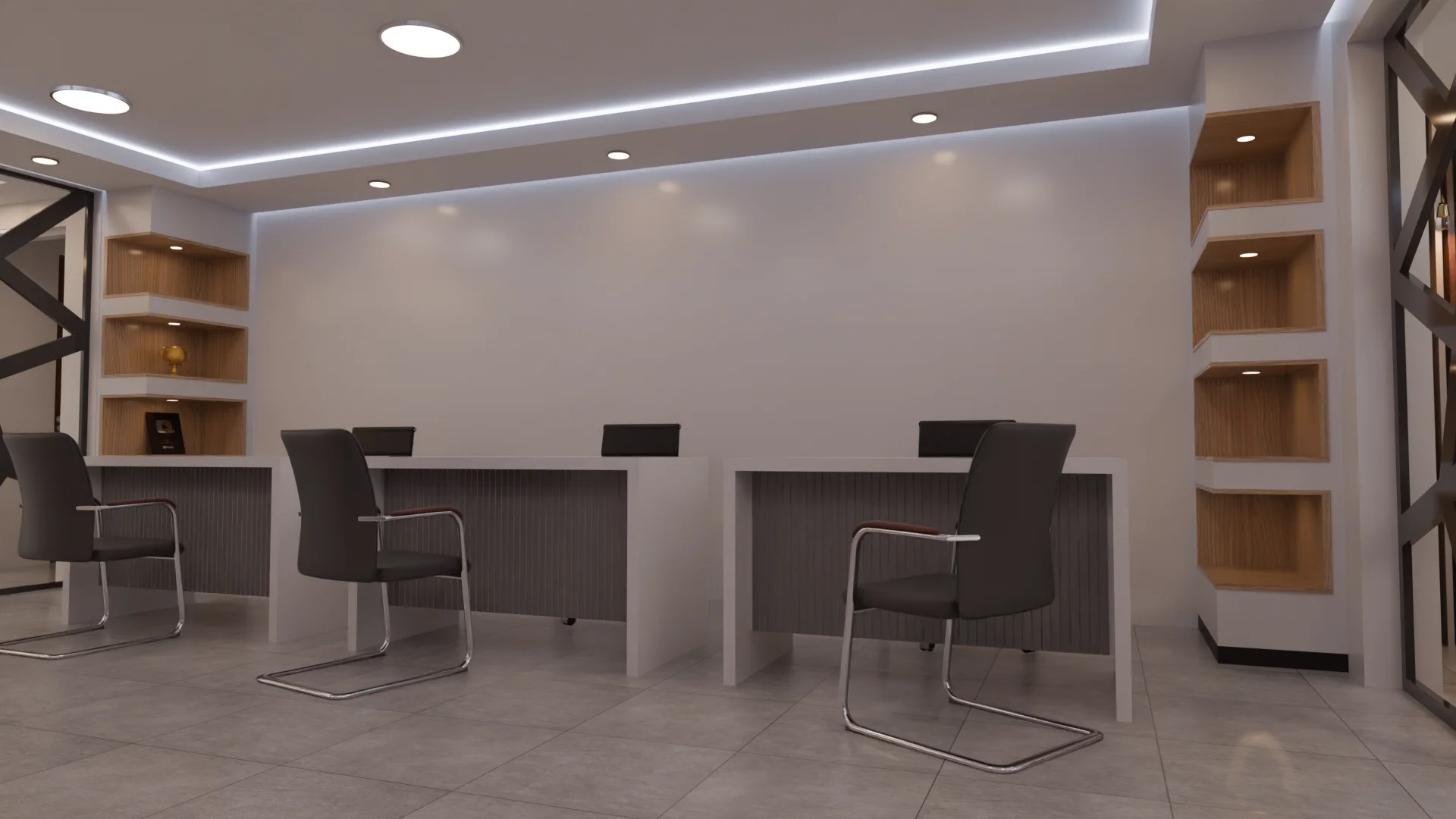
Our first task was establishing a shared design language that could accommodate two distinct brands within a single architectural expression. The solution was a continuous spatial framework, consistent flooring, ceiling coffers with integrated LED cove lighting, and warm oak shelving niches, within which each unit's brand identity is expressed through accent walls and signage.
The Padre Pio purple makes an immediate statement on entry, applied as a full-height feature wall carrying the company logo and brand mark. A bold geometric steel cross-brace element divides the public service zone from the back-of-house, adding visual depth and a contemporary structural quality to what would otherwise be a straightforward rectangular plan.
Outcome
Both units were completed on schedule and handed over fully operational. The design successfully translates Padre Pio's brand values, accessibility, professionalism, and trust, into a physical environment that communicates credibility from the moment a client approaches the glass frontage. The fit-out has since become a reference point for the group's branch rollout programme.